| | thepotteries.org |
|
|
The Brownfields were potters in Cobridge, Stoke-on-Trent, North Staffordshire from about 1836 to the end of the 1890s. William Brownfield began as a junior partner in the firm of Robinson, Wood & Brownfield and eventually William Brownfield became the sole owner. The
factory produced a range of quality earthenware and porcelain
ware. In the International Exhibition of 1862
they were awarded a medal for "printed earthenware". Entries at other International
exhibitions followed. In 1871 William Etches Brownfield entered the
business and it became William Brownfield & Son. William Sr. died in
1873 and William Jr. continued and his brother Edward Arthur Brownfield
joined the firm.
Around 1890 the business failed, in part to Edward Arthur's lack "of staying power" The company’s last swansong was an unusual venture fostered by Arthur Edward Brownfield, who in 1892 created a Potter’s Guild based on John Ruskin’s principles. But this "cooperative" was unfortunately destined to failure and the company was wound up in 1900.
Production of the Puck patterns by W. T. Copeland In the early 1890s, when the Brownfield business was in financial difficulty, the right to some of the Puck designs was sold to W.T. Copeland & Sons Copeland appears to have produced six of the designs during the 1894-1910 period. |
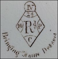
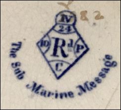
Registration details
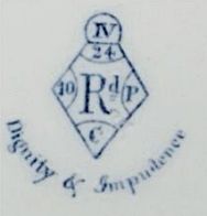
the registration diamond shows that the design "PUCK" was registered on the 24 January 1877 |
 |
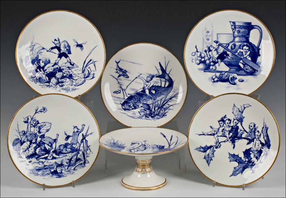
examples of six of the scenes
which make up part of the 12 in the Puck series
photo acknowledgement: tooveys
|
|
1. Mischief Begins (the introduction of Puck-like behaviour)
Interpretation:
|
||
 |
 |
 |
| Mischief in the Air | Rejected Addressee |
An Unpleasant Interruption |
![]()
|
2. Social Chaos (conflict and comedy)
Interpretation:
|
||
 |
 |
 |
| Dignity
& Impudence |
Sauve
Qui Peut (every man for himself) |
Friends
in Need |
![]()
|
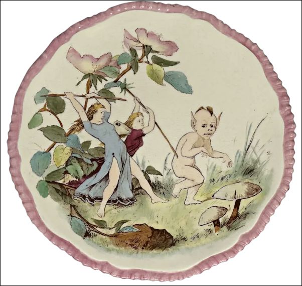
3. Playful Interludes (fairy recreation)
Interpretation:
|
||
 |
 |
|
| See-Saw | A Hard Nuck to Crack | |
![]()
|
4. Adventure and fantasy
Interpretation:
|
||
 |
 |
|
| The Sub Marine Message | The Captivated Elf | |
![]()
|
5. The Feast / Conclusion
Interpretation:
|
||
 |
 |
|
| Bringing Home Dessert | Ye Christmas Carol | |
![]()
Mischief in the Air
|
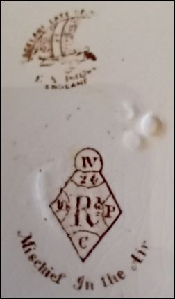
Mischief in the Air this example was produced by W.T. Copeland around the 1894-1910 period |
photo source: on-line market place
EBay
![]()
Rejected Addressee

detail from Rejected Addressee produced by Brownfield
|
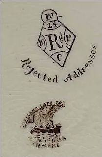
Rejected Addressee produced by Copeland |
photo acknowledgement: Rubylane
![]()
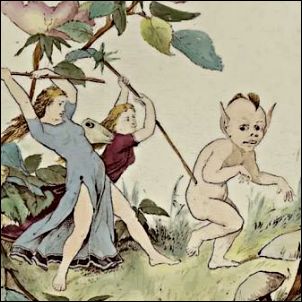
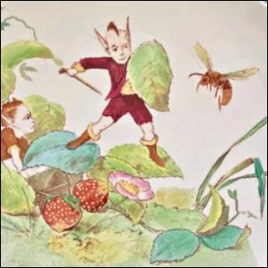
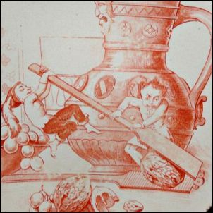
An Unpleasant Interruption
 In this pattern, Puck and his friend are interrupted from their enjoyment in the strawberry patch by a very large bee. Puck is defending himself with a stick and leaf. |
 An Unpleasant Interruption produced by Copeland |
|
"The painted pattern number 2/4865 indicates it comes from the "2" series of "E" (earthenware) patterns produced between 1874 and 1933. Steven Smith in "Spode & Copeland. Over 200 Years of Fine China and Porcelain," 2005, the author shows an example of Copeland's treatment of this pattern and states it was produced c. 1902." |
photo acknowledgement: Adrienne T. Boggs
![]()
Dignity & Impudence
|

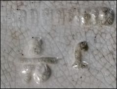
Dignity & Impudence Impressed maker's
mark for |
photo acknowledgement: Aesthetic Antiques
![]()
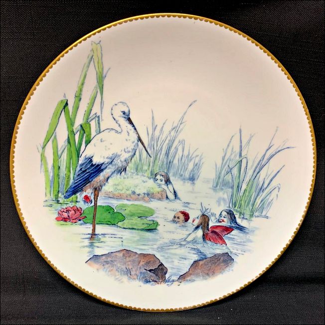
Sauve Qui Peut

|
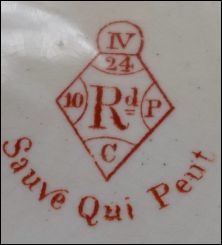
Sauve Qui Peut |
photo source: on-line market place EBay
![]()
Friends in Need

|

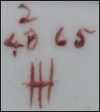
Friends in Need Impressed maker's
mark for the impressed 3/79 is the month/year of
manufacture |
![]()
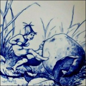
See-Saw
See-Saw
a winged fairy and Puck playing on a makeshift seesaw, turning ordinary children’s play into a whimsical fairy activity.
![]()
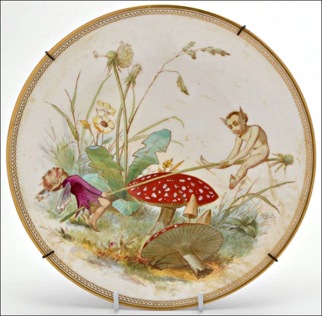
A Hard Nuck to Crack
A Hard Nuck to Crack
photo source: Worthpoint
![]()
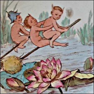
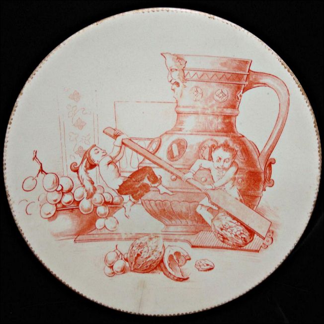
The Sub Marine Message

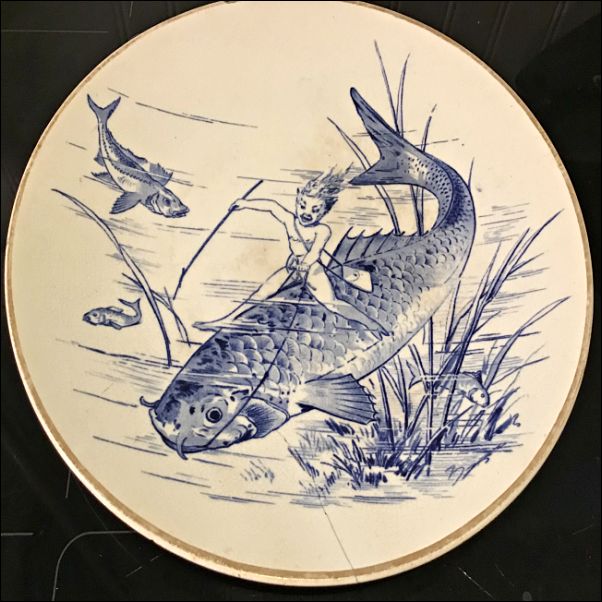 Fairies are shown communicating underwater, often involving fish or water plants. The title is a Victorian pun — “sub-marine” simply meaning under the sea, long before the modern submarine became common. |
 The Sub Marine Message
|
photo courtesy: John Whittock
![]()
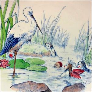
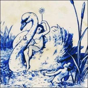
The Captivated Elf
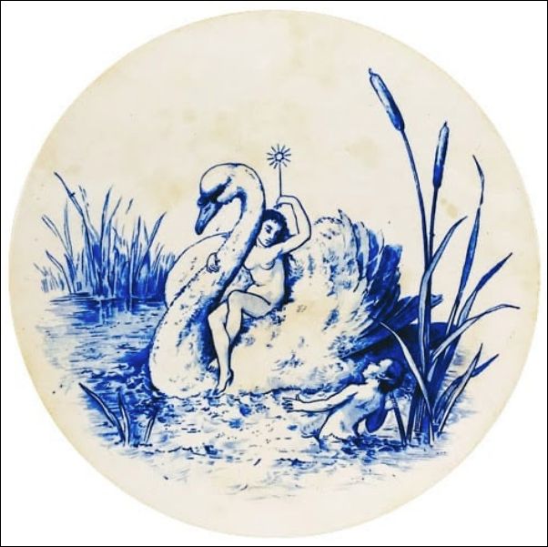
"This pattern features a scene of a nude fairy holding up a wand with a star, riding on the back of a swan swimming in the shallow water. An elf (Puck) is standing in the water near a large cattail plant, looking at the fairy." |
The Captivated Elf
Impressed maker's mark for William Brownfield & Sons. Impressed "8/79" indicates a manufacture date of August 1879. |
photo acknowledgement: Adrienne T. Boggs
![]()
Bringing Home Dessert

photo source: on-line market place EBay
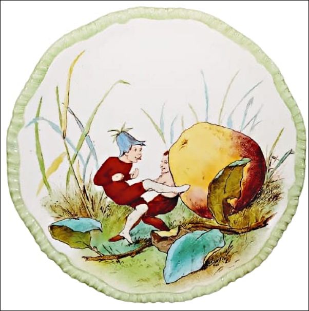
"In English Folklore, Puck is a mythological fairy or sprite of mischievous nature. Puck is also a generalized personification of land spirits. In this pattern, a fairy or sprite in a flower hat appears to be rolling an apple with his feet while another sprite leans his back against it to help push. Presumably the apple is the dessert they are bringing home to share with the other sprites." Tiny sprites struggle to carry an oversized fruit. The joke is the reversal of scale — what is a normal dessert for humans becomes a huge burden for fairies.
|
impressed Copeland mark
Bringing Home Dessert
|
photo acknowledgement: Adrienne T. Boggs
![]()
Ye Christmas Carol

Sprites sing or celebrate around a festive scene. The pseudo-medieval spelling “Ye” was fashionable in Victorian decorative titles. |
Ye Christmas Carol
|
photo acknowledgement: babbastore
![]()
![]()
|
Page created 9 March 2026 |